Many articles online showcase cool examples of Team pages, and they are indeed impressive. However, those examples often focus on simpler team structures.
What if you need to design and structure a Team page for a complex organization with multiple leaders and a large number of team members? This scenario is common for upper-small to mid-sized companies, where the goal is not just to highlight executives but also to showcase middle management and junior staff. Most websites still display only executives, directors, or board members, leaving out the broader team.
But what if you want to be inclusive and showcase everyone? Designing a team page that balances visibility, usability, and organization can be challenging—but there are effective approaches.
We have compiled several examples of complex team pages that successfully highlight entire teams. Let’s explore their strategies:
Approach #1: Search and Filter
This approach lets visitors quickly locate team members by role, expertise, capability, or department — making it especially effective for large organizations. By combining a clear layout with powerful search and filter options, it keeps the page organized while ensuring that every team member is visible and easy to find.
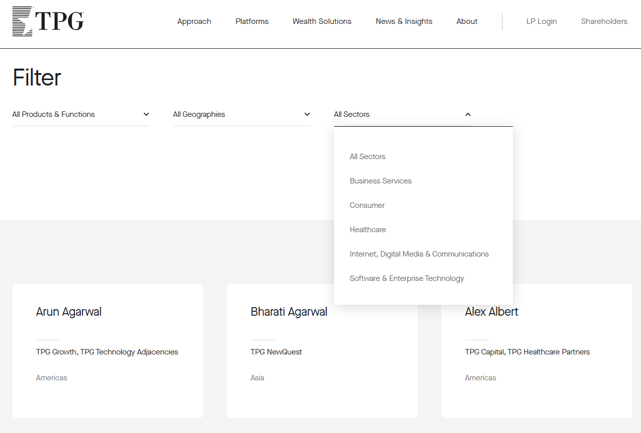
TPG
Features a clean and intuitive search function, allowing visitors to quickly locate team members by products & functions, geographies, or sectors. The layout is minimalistic yet highly functional, ensuring ease of use.
IDEO
Features a versatile filtering system that allows visitors to narrow down team members by industry of expertise or by capability. The layout remains clean and focused, while a playful hover effect adds personality—when you move your cursor over a team member’s photo, it switches to a more casual, fun image, giving a sense of their character.

Approach #2: Classic Cards for Executives + Search/List for Senior Management
This hybrid approach highlights top leadership using visually distinct profile cards, while offering a searchable and filterable list for senior management. It balances prominence for executives with accessibility for the broader management team, keeping the page organized and easy to navigate.
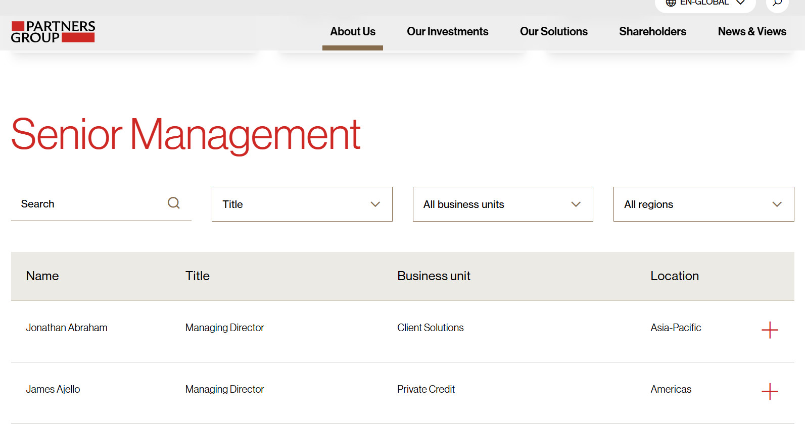
Partners Group
Executives and board members are showcased prominently using classic profile cards, while senior management is presented in a searchable and filterable list. This layout highlights top leadership without overwhelming the page, keeping the rest of the management team easy to access and well-organized.

Approach #3: Clear Separation by Department or Division
Organizing team members by department helps visitors understand the structure at a glance. This approach works well for companies with multiple divisions or specialized teams.
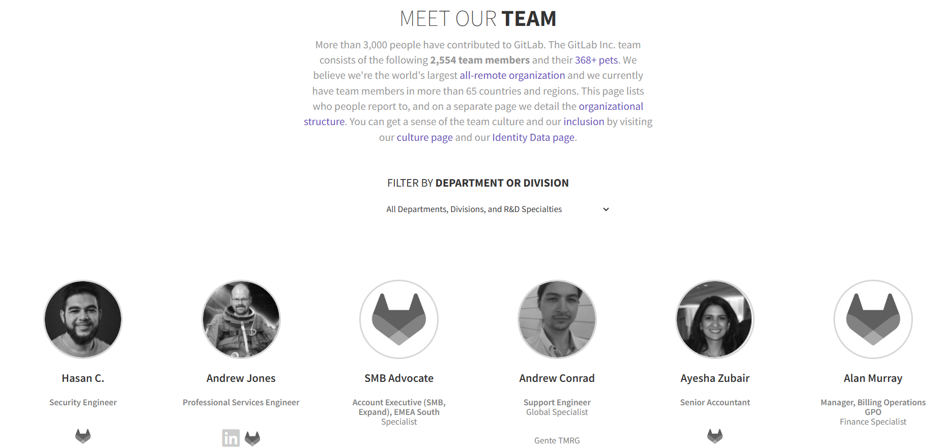
GitLab
Features a detailed filtering system that lets users sort team members by department, division, or specialty — making it easy to navigate among hundreds or thousands of profiles.
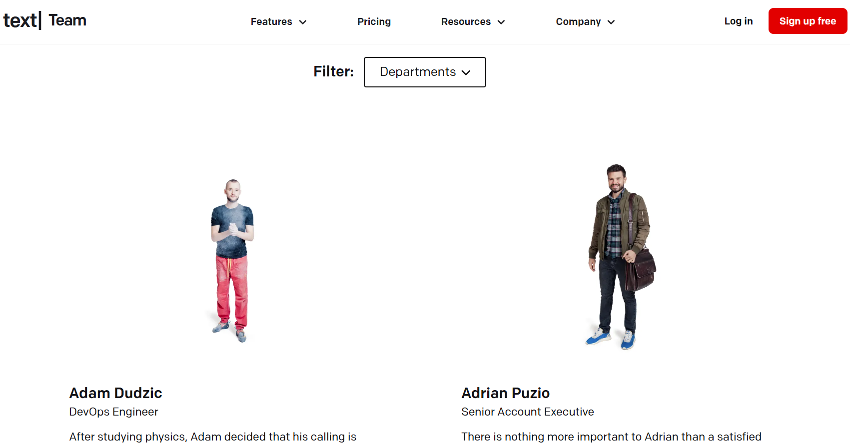
Text
Features a filtering system that allows visitors to browse team members by department — making it easy to navigate through a large and diverse staff.
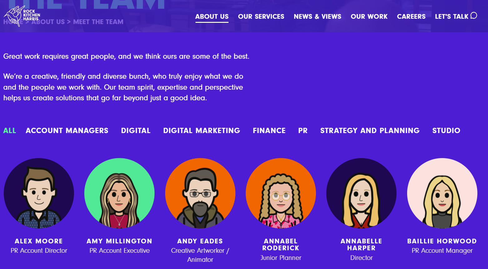
Rock Kitchen Harris
Offers a well-structured team page where visitors can filter staff by department — including Account Management, Digital, PR, Studio, Finance, and more. Additionally, the use of illustrations instead of photos adds a playful touch, reflecting the brand’s personality.
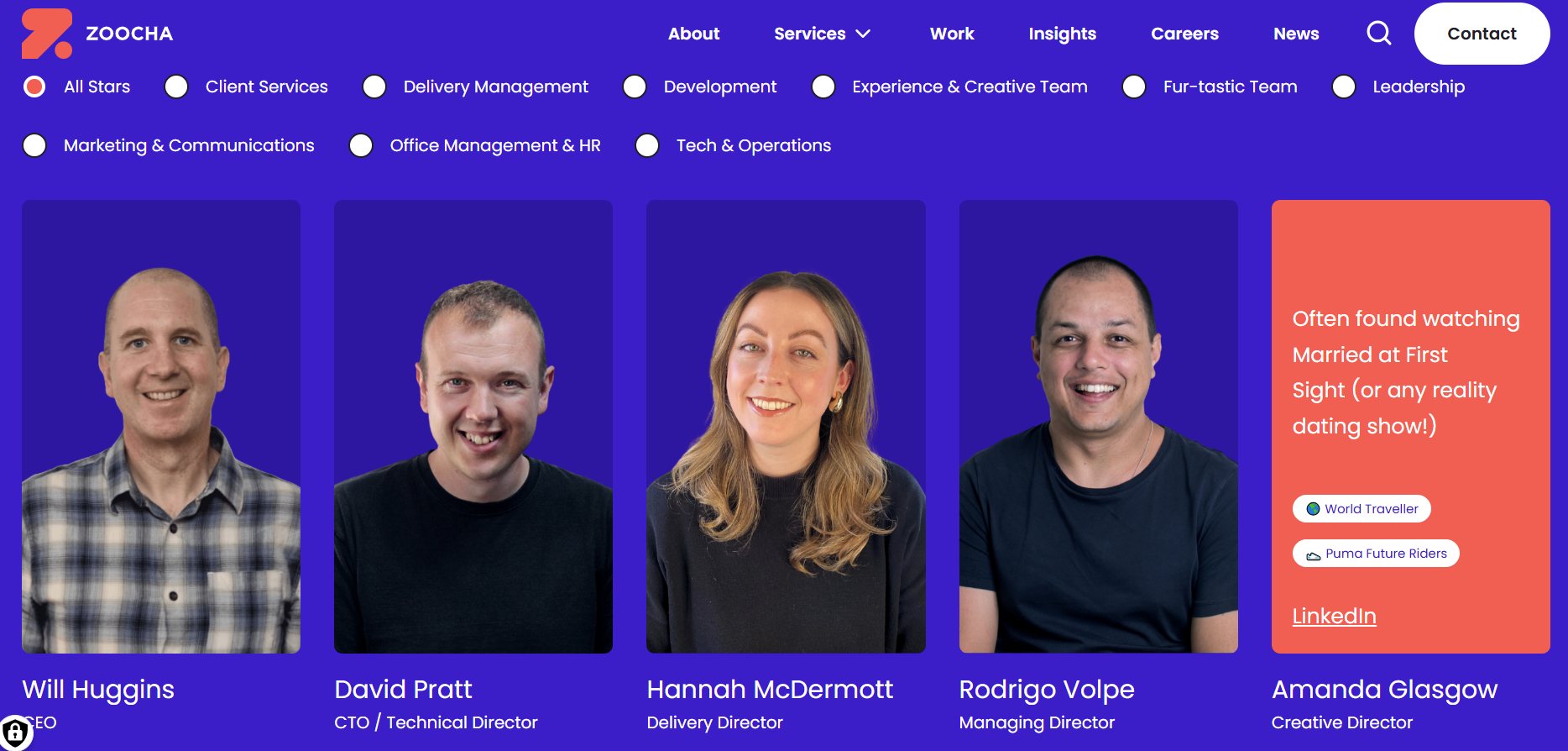
Zoocha
Implements a clean filtering interface that allows visitors to browse team members by department, making it easy to navigate their wide and diverse staff of more than 90 people. The layout stays organized and friendly, and the design — mixing professional and personal touches — reflects the company’s creative and inclusive spirit.
Approach #4: Leaders on One Page, Full Team on Another
This approach strikes a balance between showcasing leadership and giving visibility to the entire staff, establishing a clear hierarchy while ensuring no team member is overlooked. It’s an effective solution for organizations that want to feature their leaders while also giving recognition to the whole team.
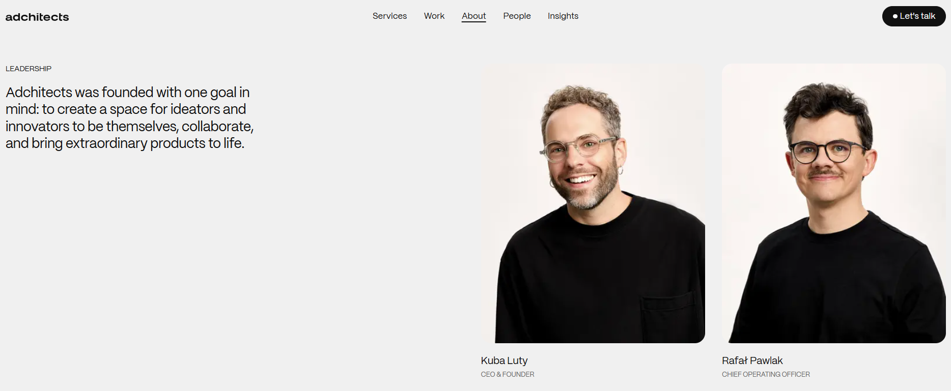
ADChitects
Leaders are featured prominently on the main page, followed by a preview of the wider team with a clear call-to-action to meet all 34 professionals on a separate page.

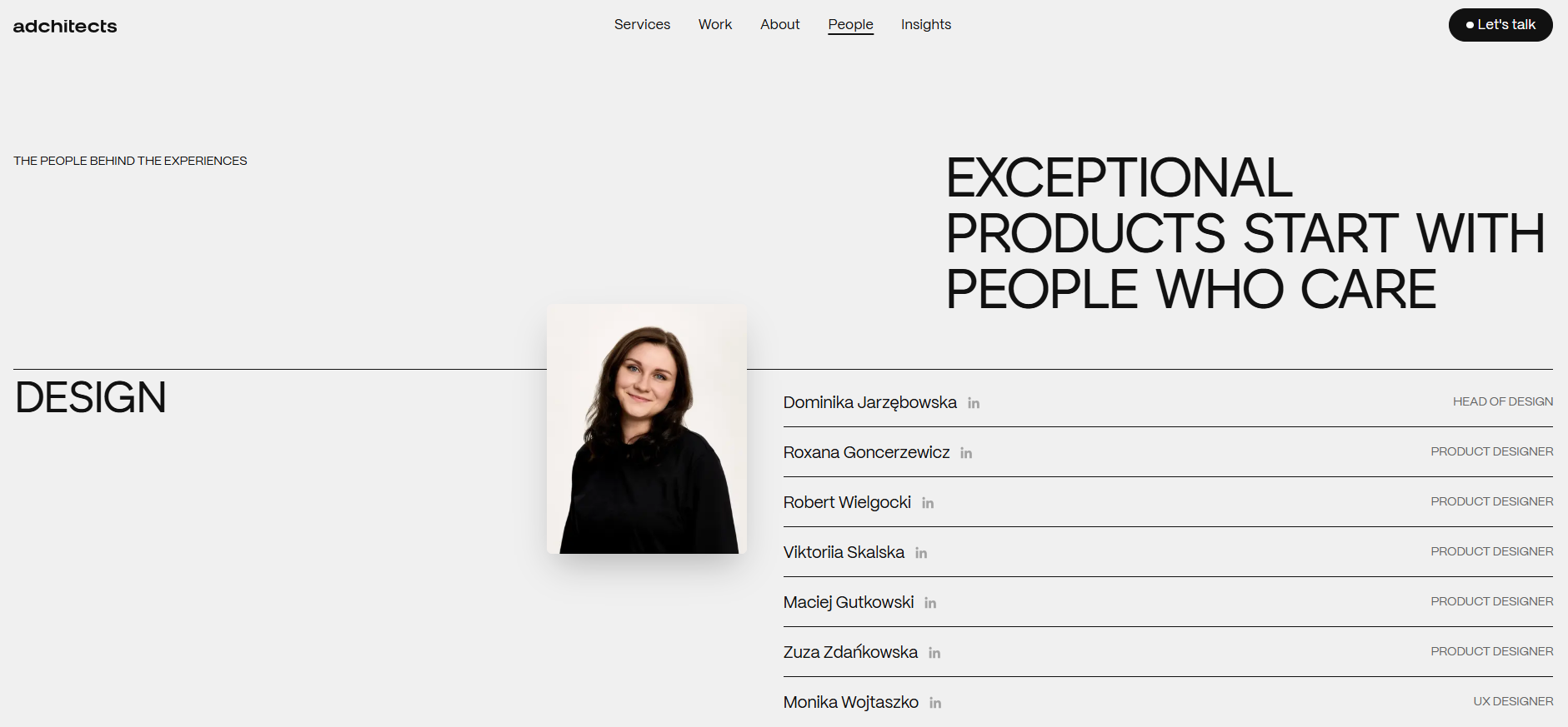
On the “People” page, the full staff is presented in a clean, organized layout, with a playful hover effect that reveals an alternate photo of each person.
Key Takeaways for Designing Complex Team Pages
Designing a Team page for a complex organization is all about balance: showcasing leadership, giving visibility to the full team, and keeping the page user-friendly. Here are some best practices to consider:
- Prioritize Clarity:
Divide your team into clear sections—by leadership level, department, or division—so visitors can easily understand the company structure.
- Use Search and Filters:
For large teams, include search and filter functionality. This allows users to quickly find the person or role they’re looking for without overwhelming the page.
- Highlight Leadership Strategically:
Prominent cards for executives and key leaders help establish authority, while other staff can be shown in lists, grids, or secondary pages.
- Keep Profiles Concise:
Include essential information such as name, role, and a short bio. Overly detailed profiles can clutter the page, especially for large teams.
- Maintain Visual Consistency:
Use consistent card styles, fonts, and color schemes to unify the team page, even if you separate it by departments or leadership levels.
- Consider User Experience on Mobile:
Many visitors access websites via mobile devices, so make sure the layout, filters, and navigation work seamlessly on smaller screens.
By combining these strategies, you can create a team page that is both inclusive and easy to navigate. Whether you choose search and filter functionality, clear departmental separation, or hybrid layouts, the key is to make every team member visible while maintaining a clean and engaging design.