While it's disappointing and frustrating to hit a broken link, a custom 404 page can give users options for further actions, and reassure them that a website has been well considered on every level.
Website visitors land on a 404 error page when they try to visit a page that does not exist. This can happen if the page has been removed, the server or internet connection is down, or users have clicked on a broken link or mistyped a URL.
A 404 page must first of all clearly state that there is an error. While the number 404 has become a universal symbol for an error, website designers should not rely on displaying this symbol alone. The best solution would be to accompany the number with text. The second most important thing to include would be options for where to go instead.
Other elements on a 404 page are limited only by the designer's imagination. There are pages with crazy animations, funny GIFs, and masterpiece illustrations... As for me, I follow the simple rule: "Be consistent with the brand and make sure the user feels taken care of."
Let's have a look at four examples that showcase 404 pages on my clients' websites, which vary in type.
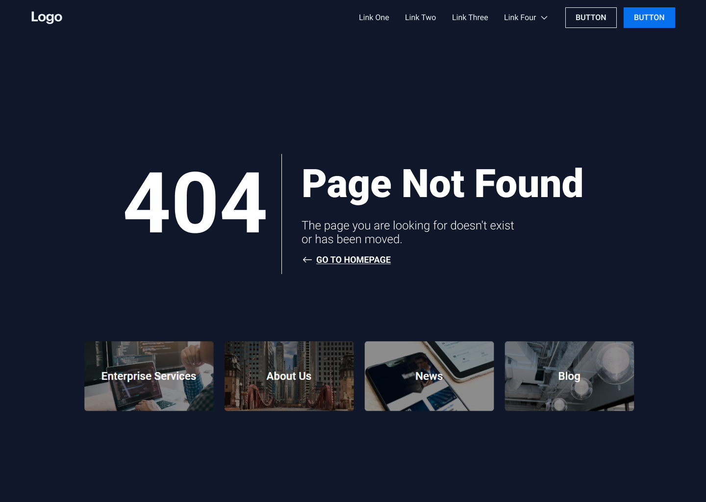
1. This is a 404 page for a content-heavy website in the cybersecurity industry. Users are not only given the option to return to the homepage, but are also presented with four blocks containing links to the pages of highest interest.
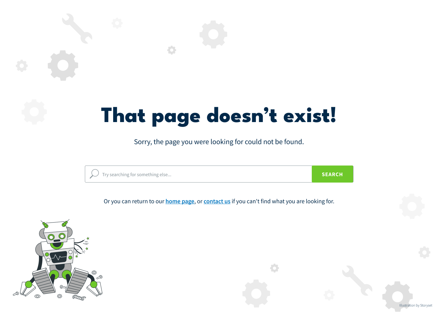
2. This is a 404 page for a website offering a wide range of services. In this example, illustrations are the main visual asset type. If a user is hesitant to use the search box, they can always go to the homepage or contact page.
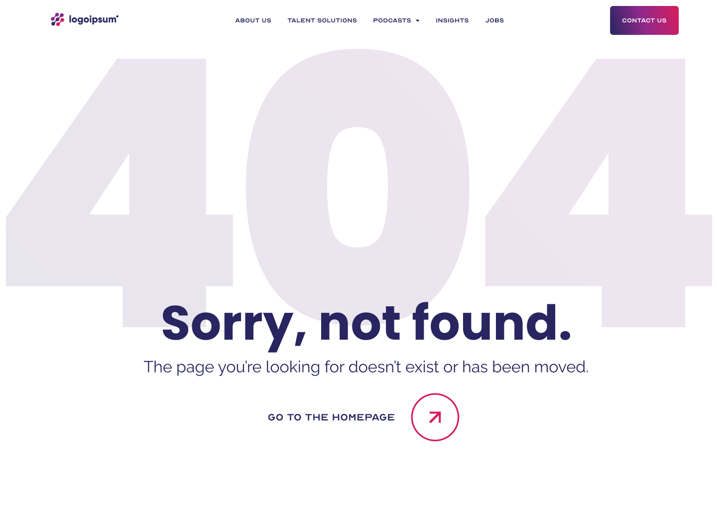
3. This website doesn't have illustrations or images in its arsenal. The visual style relies mostly on a vibrant color palette and graphic shapes. So, it was decided not to use either of them, but instead to use a dimmed gradient to give users a feeling of safety and not overwhelm them.
4. This is a 404 page for the next version of my portfolio website. The message includes some irony, and the facial expression supports it. However, the tone here isn’t rude, just straightforward. It reflects the promise expressed on the homepage that our business relationships will be drama-free. Straightforwardness means getting things done and getting results in the shortest period of time without loss of quality. I'm true to myself even on the page that nobody will hopefully ever see.